Pantone 2025 color of the year: Mocha Mousse
Mocha Mousse is having a moment. Explore Pantone’s 2025 Color of the Year and why this cozy hue is anything but basic.

The big reveal: Mocha Mousse ☕🤎
Every year, the Pantone Color of the Year announcement sends our creative team into full speculation mode—and 2025 was no exception. Guesses flew. Green loyalists rallied behind their favorite shades. Others were convinced deep purples were having their moment. Someone even asked ChatGPT, which very helpfully (and very on-brand) suggested Ultimate Gray.
But one prediction stood out. There was a growing sense that Pantone might be ready to return to something warm, grounded, and quietly luxurious—something we hadn’t seen in a while. A hue rooted in nature but elevated. Earthy, modern, and sophisticated.
Enter Mocha Mousse.
Yes, Pantone’s 2025 Color of the Year is officially brown—and honestly? We’re here for it.
Rich, warm, and surprisingly versatile, Mocha Mousse feels like a reset. It’s cozy without being heavy. Elevated without being precious. And it opens the door to a whole new palette of creative possibilities.
Let’s break down why this color works—and how we’re already imagining it coming to life.
Why Mocha Mousse works
A versatile staple
Mocha Mousse is one of those rare colors that plays well with just about everyone. It layers seamlessly with greens, tans, blacks, metallics, jewel tones—you name it. With animal prints like cheetah trending and black-and-tan palettes having a moment, this color feels less like a trend and more like a staple. Timeless, grounded, and effortlessly cool.
Elevated event energy
In event design, Mocha Mousse brings instant warmth and sophistication. Its earthy base creates a grounded foundation, while still allowing for drama through contrast. Pair it with metallic accents for a polished glow, deep blues for richness, or jewel tones for a refined edge. It works just as beautifully in modern spaces as it does in rustic or organic environments—proof that neutral doesn’t mean boring.

A color you can feel: Sensory experiences
If you loved our Tasteful Rhythms case study—where sound, flavor, and design collided—Mocha Mousse is very much in that same sensory-forward lane. This color invites guests to slow down, tune in, and experience events with more intention.
Culinary moments, elevated
Mocha Mousse naturally lends itself to indulgence. Think mocha-inspired desserts, chocolate-forward cocktails, espresso martinis, and beautifully styled coffee bars that pull guests in before they even take a sip. Layer in thoughtful lighting, curated music, and subtle scent cues, and suddenly food and beverage become a fully immersive experience—not just a menu item.
Wellness, reimagined
This hue also shines in wellness-forward environments. Mocha Mousse has a grounding quality that instantly calms a space, making it ideal for Zen Dens, recharge lounges, and moments of pause within busy agendas. Whether paired with soft textures for a minimalist feel or layered into richer palettes for a more maximalist approach, it creates an inviting backdrop that feels safe, warm, and intentional.
Neurodiverse-friendly by nature
Neutral, earthy tones like Mocha Mousse are especially effective in neurodiverse-friendly environments. The color helps reduce sensory overload and supports focus, making it a strong choice for conference spaces, educational sessions, and high-information environments. It brings stability to a room—quietly supporting learning and well-being without demanding attention.

Where we’ll see it shine
Mocha Mousse feels right at home in regions where the landscape already leans warm and organic. In places like Texas and Arizona, it blends seamlessly with terracotta, sand, sage, and sunbaked textures—perfect for events inspired by the Southwest.
In destinations like Las Vegas, the opportunity lies in contrast. Swap traditional hedge walls for dried pampas grass. Pair Mocha Mousse with bold metallics. Let it soften the high-gloss energy of the Strip while still delivering a modern edge. Unexpected, elevated, and undeniably Vegas.

Final sip
Mocha Mousse isn’t just a color—it’s a mood. Warm. Sophisticated. Grounded. It invites connection, encourages sensory storytelling, and proves that brown can be anything but basic.
We’re excited to see where this hue takes us in 2025—and even more excited to bring it to life in ways that feel thoughtful, immersive, and very Cohera.
So tell us: how would you use Mocha Mousse?
Browse our blog
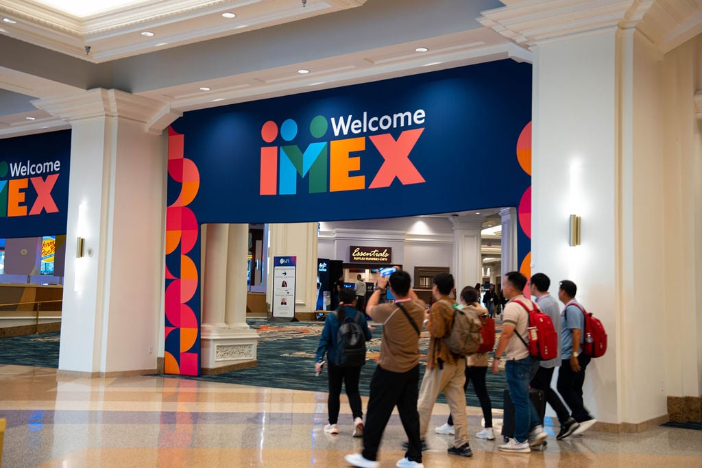
Stop wandering. Start working IMEX.
Read more
IMEX America is big. Your time is precious. Make every meeting count with tips for smarter planning, meaningful connections, and a little room for the unexpected.
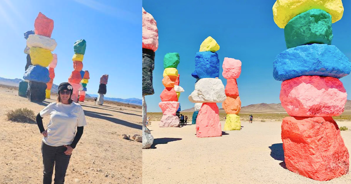
Look again: Finding inspiration in the city you know
Read more
Discover how exploring your own city with fresh eyes can spark creativity, deepen destination knowledge, and inspire better events.
Design matters. And we're here for it.
Read more
Good design isn't about how a room looks. It's about how people feel. IMEX and Cohera break down what experiential event design actually does.
Ready for your one-of-a-kind experience?
Your inbox is starving. Feed it something good.
Sign up for our newsletter