
 Creative

Event color psychology & design: how to use color for impact
Learn event color psychology, color theory basics, and trending palettes to design memorable corporate events.


Color us excited to talk about two of our favorite things: corporate events and COLOR! From nature to big city billboards, color is a fundamental part of our lives. It adds vibrancy to our every day, impacting our moods and decisions. When it comes to event design, understanding and utilizing color theory is crucial. Whether your grasp of tones and trends starts and ends with Crayola, or you live by the phrase, “What would Pantone do?” we’ve got you covered. Read on for the fundamentals, theories, and psychology behind color. The pot of gold at the end of this educational rainbow? Some top trending color palettes we’re tracking this year and beyond. Let’s glow!
Color 101: theory & considerations
What’s color theory all about? At Cohera, we think of it as a go-to guide for mixing, combining, and manipulating colors. The foundations of color theory are based on how color is perceived physically and psychologically. Once you understand these fundamentals, you’ll find it easier to choose colors that not only complement each other but also express the right mood or message for your events.
Honing in on your hue
Starting with the right color will help shape your event’s palette. First, we start with hue which is the pure form of any color. Hues have different meanings and spark particular emotions. For example, blue can create a calm and professional atmosphere. Here are some of the meanings behind different hues and the emotions they can evoke:
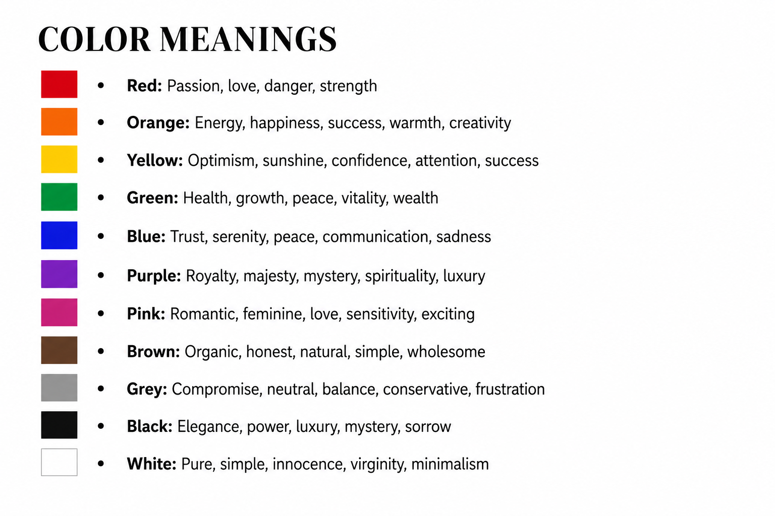
You might consider asking your client, “What mood or feeling do you want to evoke at this event?” Focusing on the attendee experience allows you to shape people’s emotions. For instance, yellow brings an air of cheerfulness, making it an excellent choice for designing a welcome reception!
You’ll want to keep cultural perspectives in mind, as well: While red may signal excitement or danger in Western cultures, it symbolizes luck, joy, and celebration in Eastern cultures. Consider using universally positive colors, such as blue for trust and green for growth when planning your next conference or event.
Your palette’s BFF, the color wheel
Let’s take the color wheel for a spin! Understanding the color wheel is essential in event design, as it guides you in choosing colors that complement each other and ensures a harmonious design. Event designers use the color wheel to experiment with diverse color combinations, adding depth and interest to any space.

- Hue: A color’s purest form.
- Tint: When white is added to a color to lighten it, tints are used to add depth and dimension.
- Shade: When black is added to a color to darken it. Use shades to create a more dynamic palette.
- Tone: The saturation of the color. The lower the saturation, the greyer the color. Pairing tones can help maintain a cohesive look throughout the event.
Perfecting your palette
Not all color schemes are the same! There are six types you can leverage to help your event show its true colors. All of our favorite trending color palettes are based on these fundamental rules.
- Monochromatic: Using one hue and all its variations (tones and tints). This creates a harmonious blend, especially on camera.
- Complementary: Using a hue alongside its direct opposite on the wheel. Complementary colors create a striking visual contrast, and you often see these combinations in children’s toys and sports team designs.
- Analogous: A palette of colors found side by side on the wheel, three in a row. It is mostly used in fashion, interior, and event design. Use the 60-30-10 rule for a balanced composition: 60% dominant, 30% secondary, and 10% accent color.
- Tetradic: Colors that form a rectangle on the wheel. Typically used by graphic artists.
- Triadic: Colors that are equidistant from each other form a triangle on the wheel. This type of scheme is typically used for branding.
- Split: These hues form a “Y” on the color wheel. Think bold colors among a couple of muted ones. Frequently used in fashion and event design.
Blending color strategy into your events
The way you apply color is just as crucial as the palette itself. Using color strategically lets you guide your attendees’ attention and behavior. The moment attendees enter the event space, the colors you use and how you use them can determine how they feel throughout the event. Here are some event components to consider:
- Signage: Use bright, contrasting colors to improve visibility and navigation.
- Tabletop Decor: Think beyond the standard elements of a tablescape. Placing a charger plate on top of a placemat can create more layers and visual interest through textures, colors, and prints.
- Event Flow: Cool colors at the entrance create a calm and professional first impression, while warm colors in the main space make them feel welcome and excited. Leverage complementary colors in the stage area to ensure their attention is focused where it matters most.
What’s hot?
You know us; we’re always looking for the latest event trends in design and beyond, and color is no exception. If you’re looking to plan a fall or winter event, look no further than this gorgeous color palette for something sleek and practical yet visually engaging.


For spring and summer, these (seasonal favorite) color palettes harness bubbly brights, epic eco-inspired tones, and country-chic classics. In other words, the future of color is confidence.


From trendy monochromes to never-fail neutrals, we hope this article made you feel like a palette Picasso! We want you to move forward this season with color confidence and an innovative understanding of color fundamentals and how to use them for your next event. Most importantly, always remember your sense of play and that it’s OKAY to color outside the lines!
Browse our blog
Designing for corporate event planners, AKA the hardest room to impress
Read more
Planning a corporate event for corporate event planners? That's our favorite kind of challenge. Here's what it takes to impress the hardest room there is.
Dive into Tampa: A planner’s playground beyond the ballroom
Read more
Discover what to do in Tampa with corporate groups, from waterfront adventures and neighborhood tours to dining, culture, and private events.
Building balance in a burnout industry
Read more
It’s no secret: burnout runs rampant in our industry. But building work-life balance isn’t a mystery—it's a necessity. Here's how the Cohera team does it.
Ready for your one-of-a-kind experience?
Your inbox is starving. Feed it something good.
Sign up for our newsletter